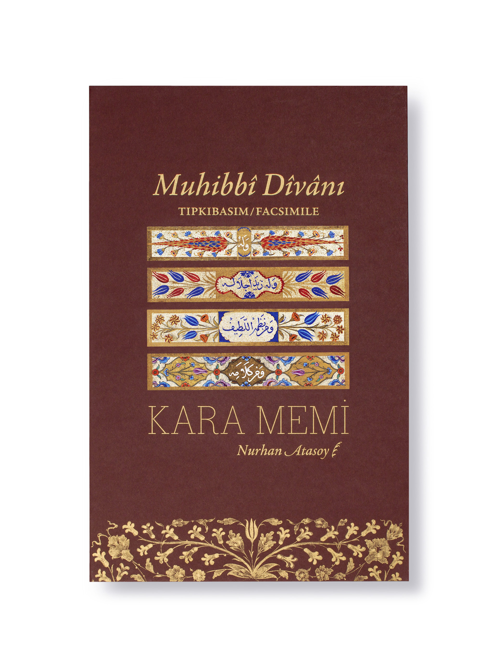
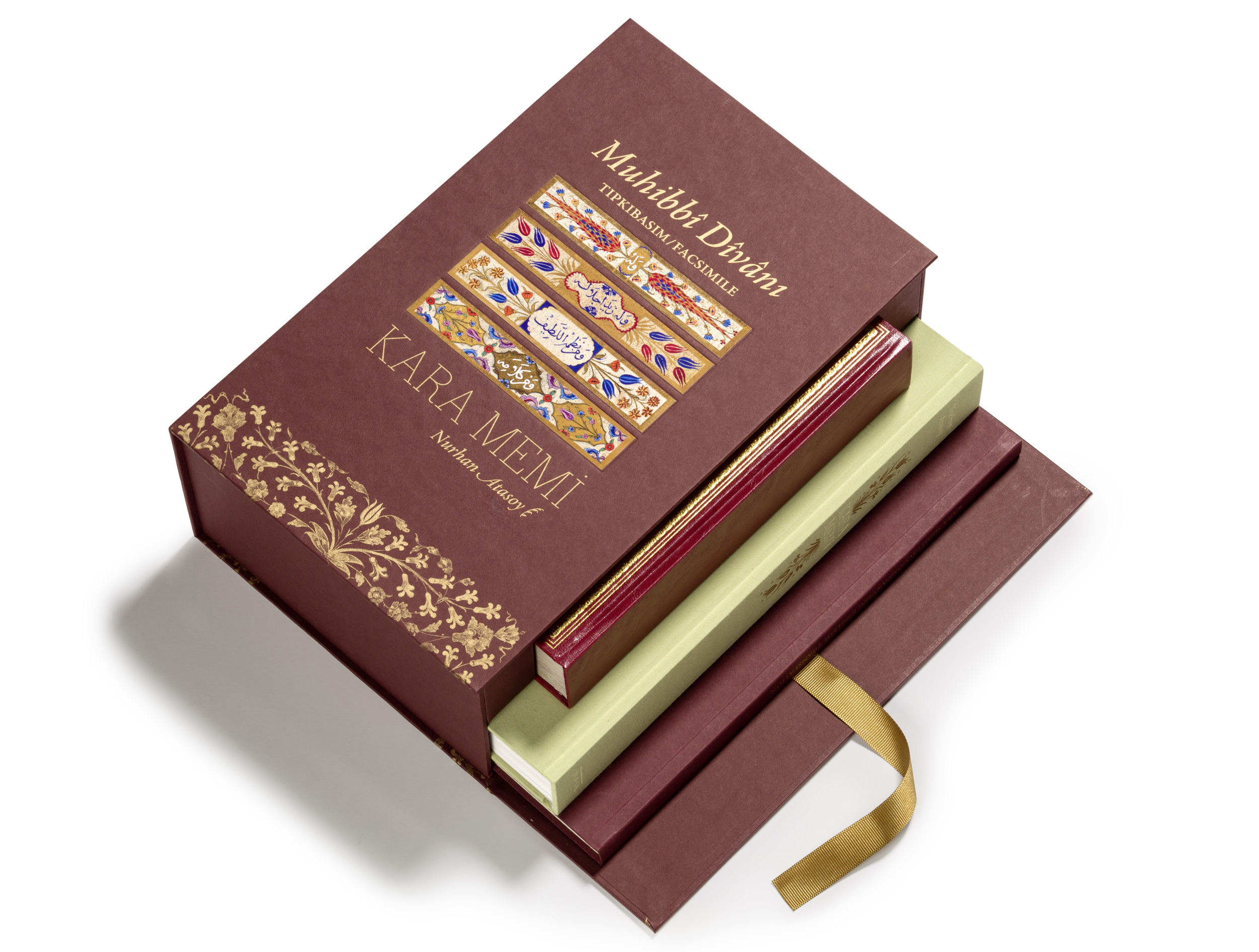
Muhibbî Divânı
tıpkıbasım
facsimile
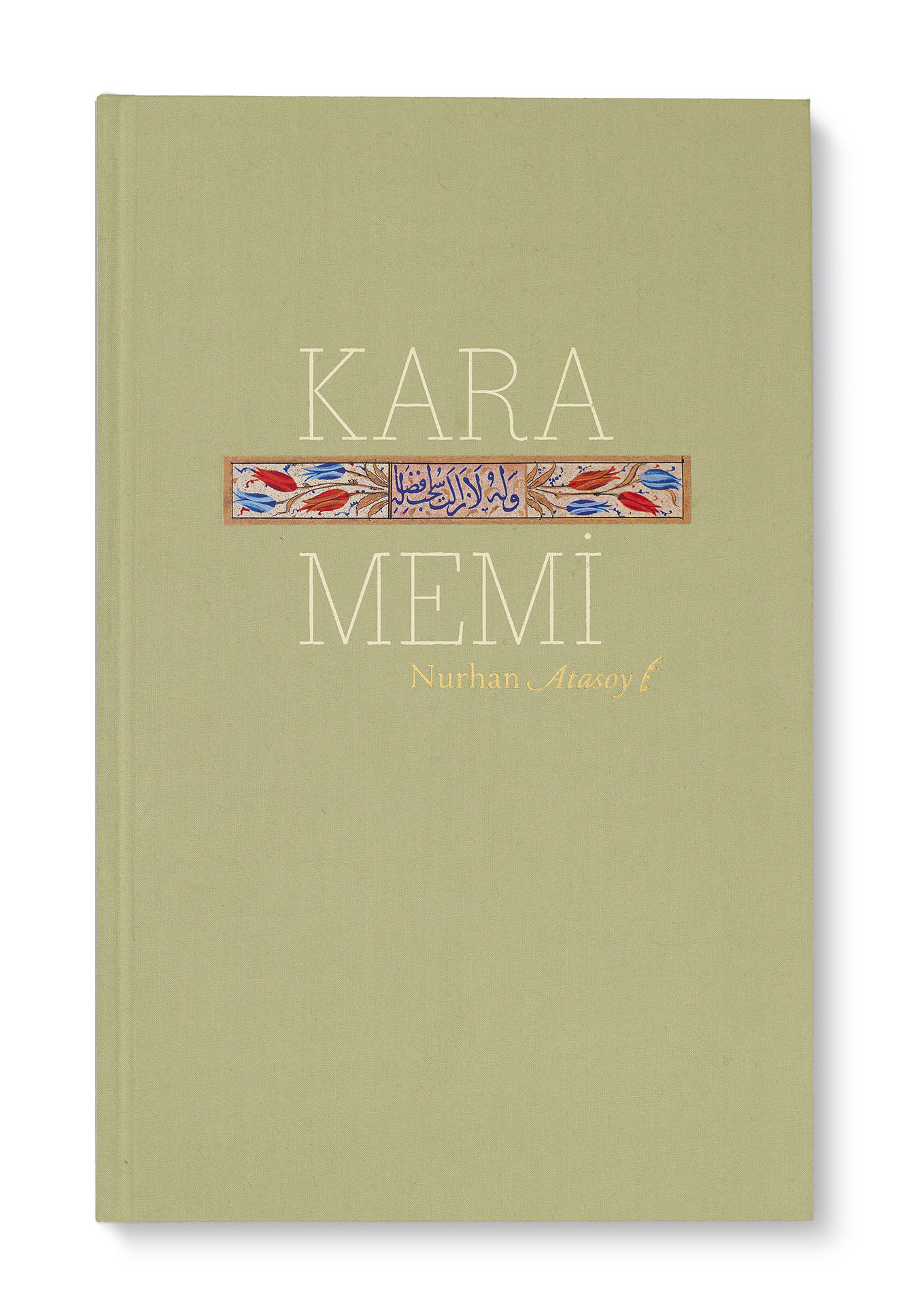
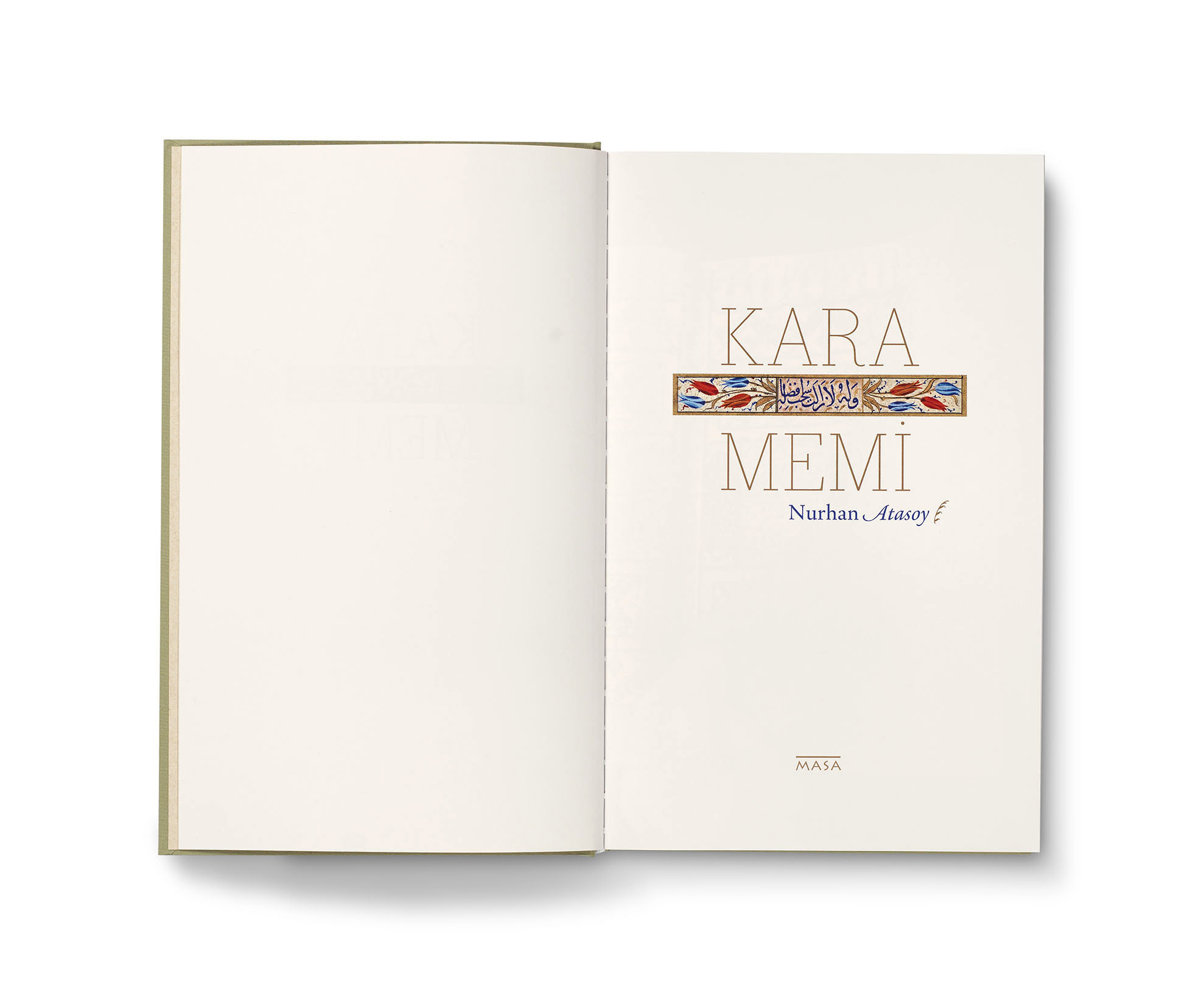
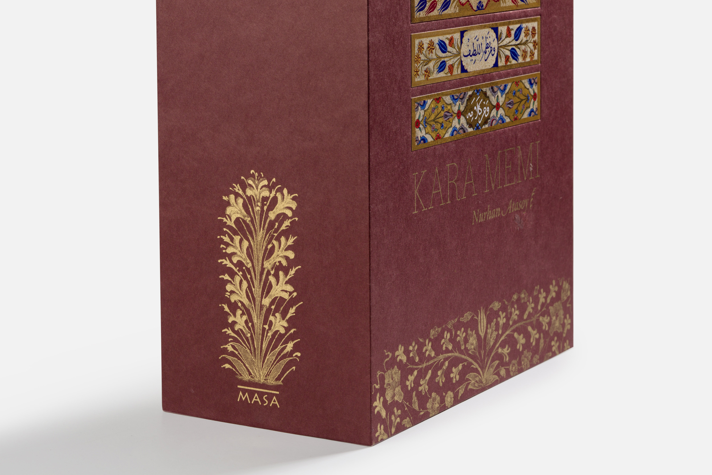
Kara Memi
“… nothing can compare to the thrill of excitement when a supremely famous manuscript itself is finally laid on the table in front of you” writes Christopher de Hamel in Meetings with Remarkable Manuscripts.
“Muhibbî Dîvânı is one of the greatest 16th century Ottoman literary works, consisting of poems written by Sultan Süleyman the Magnificent under the penname Muhibbî…” writes Nurhan Atasoy.
“… The manuscript was illuminated by chief palace artist of the era, Kara Memi and to be understood these decorative compositions must be evaluated in the context of Ottoman interest in gardens and flowers at the time.”
For more on the original, please visit: https://www.facsimilefinder.com/facsimiles/kara-memi-muhibbi-divani-facsimile
read more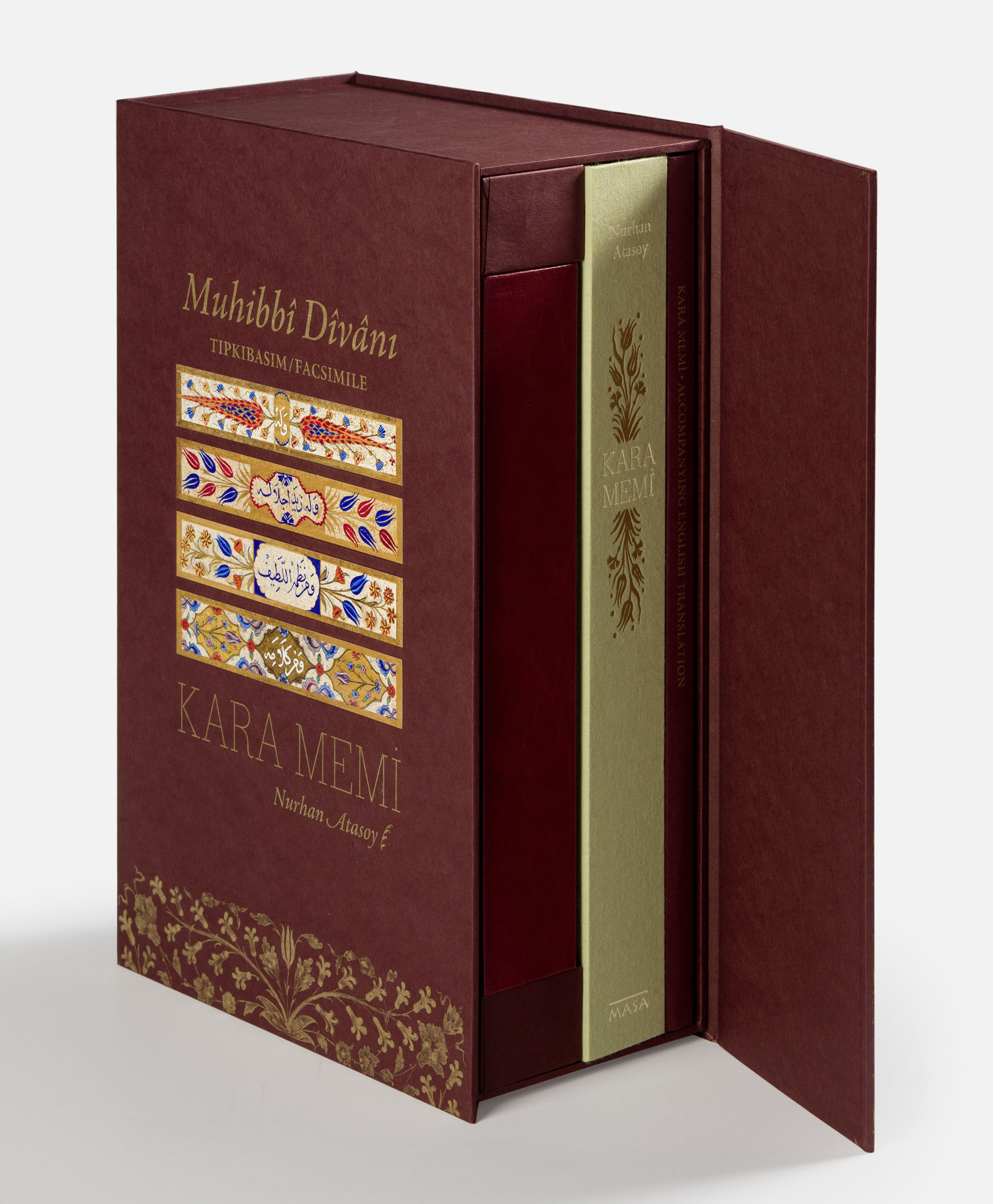
The edition contains the facsimile of Muhibbî’s Dîvân,
Nurhan Atasoy’s Kara Memi, and the English translation.
The box, on the left. The book cover, on the right.
The soft, green cloth heralds spring.
The labels printed with floral decorations have been affixed by hand. The hyacinths are silkscreened,
the titles are foil-stamped.
As its slab serifs correspond to the frames around the panels, Bodoni Egyptian by Nick Shinn was used for the title of the book.
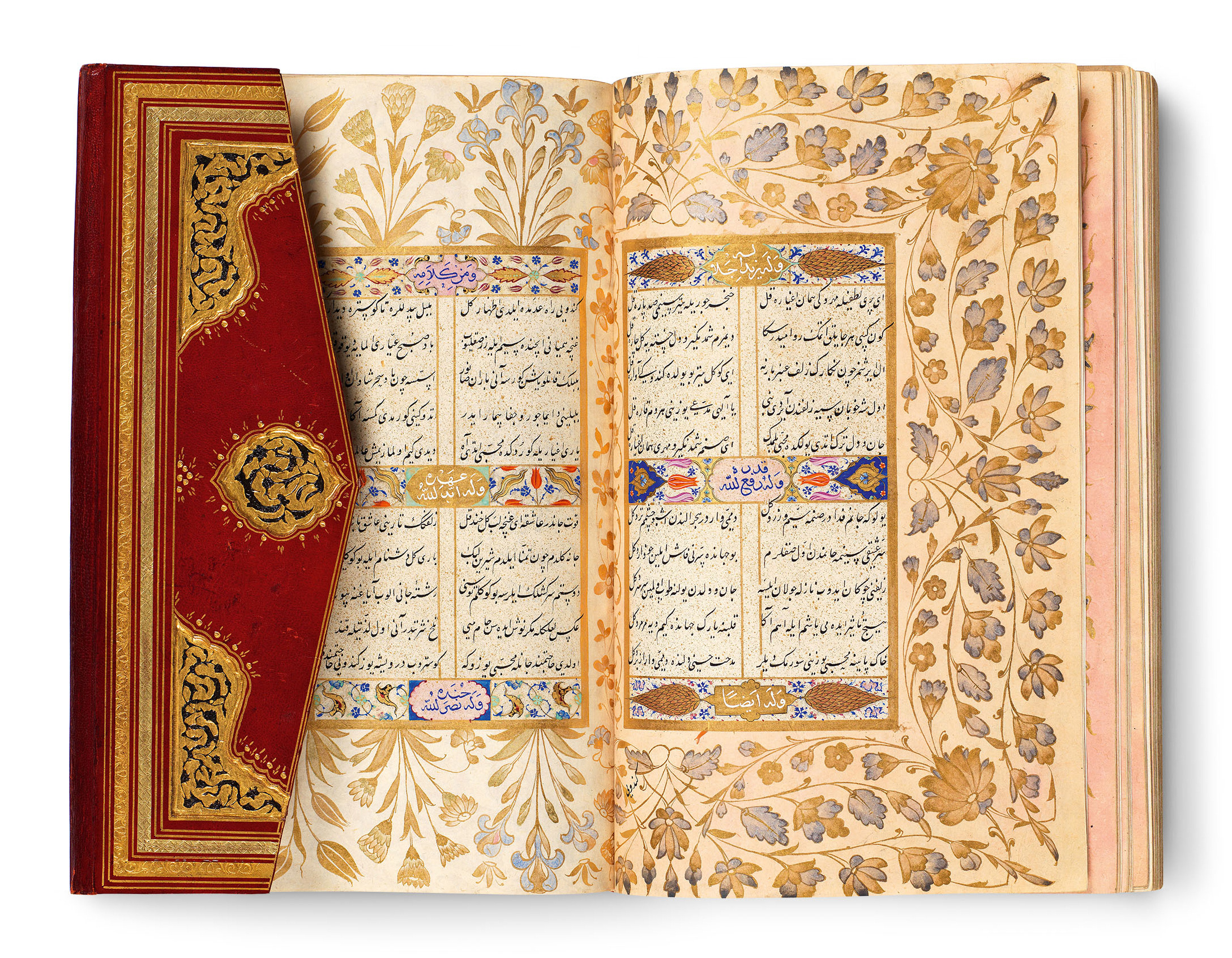
Kara Memi’s masterpiece: The copy of Muhibbî Divânı dated 1566
in the Rare Books Section of Istanbul University Library.
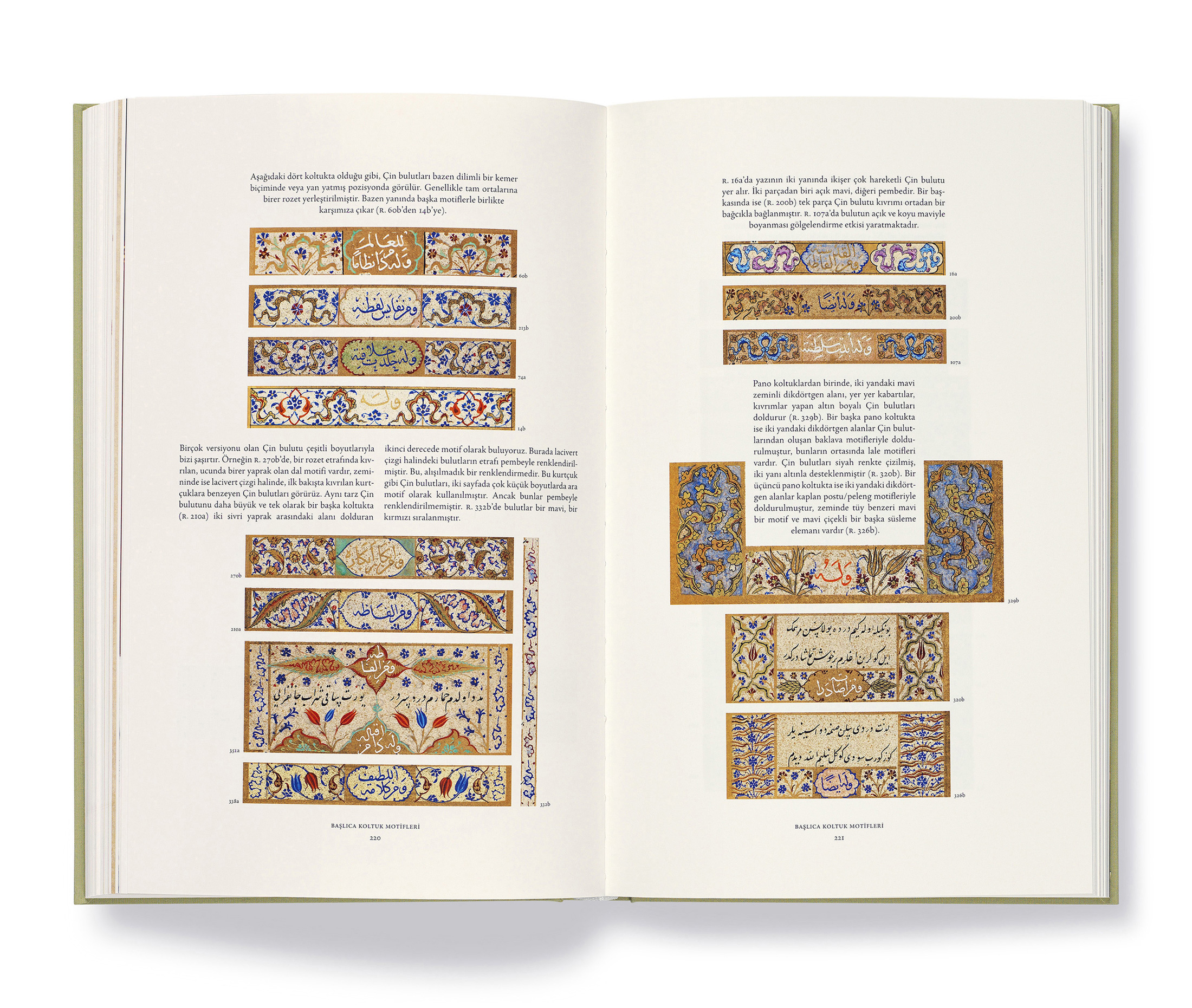
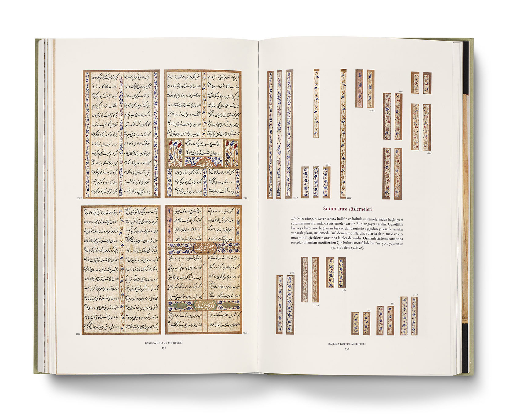
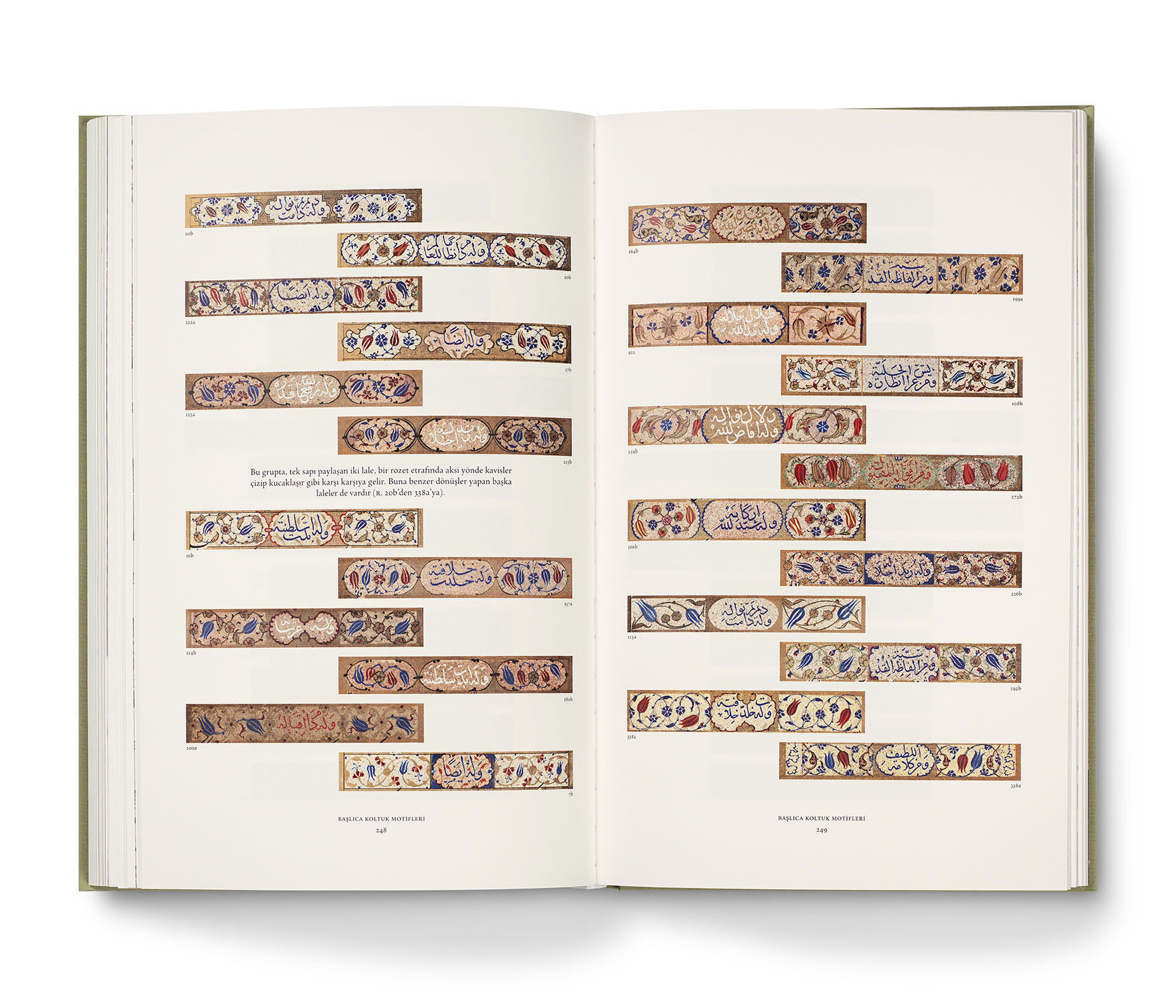
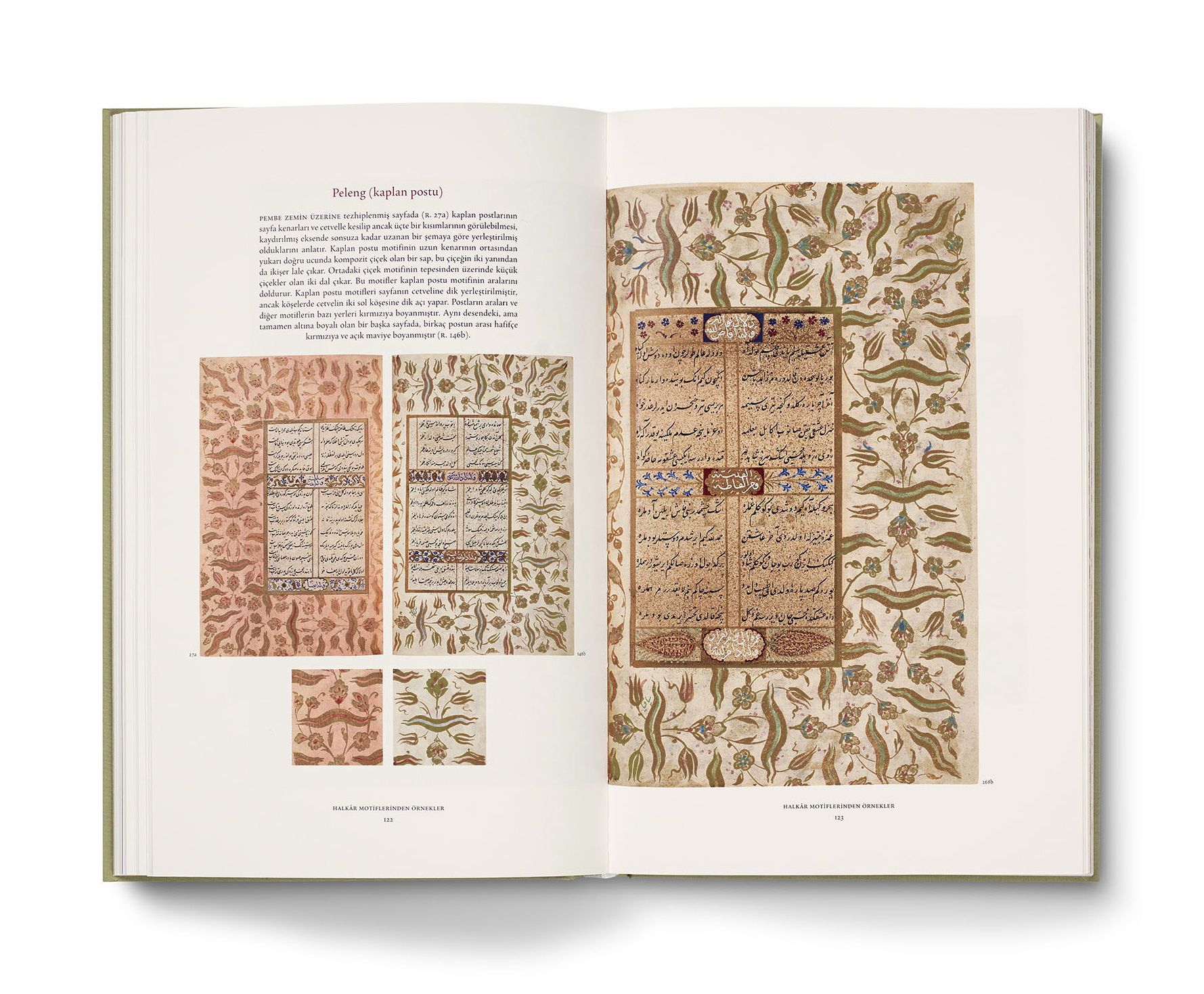
Decoration in this work consists of panels incorporating the titles of the poems (koltuk) and of gold wash designs used in the margins (halkâr). Throughout the 740 pages of the manuscript,
each of these designs
is an original.
Kara Memi’s masterpiece:
The copy of Muhibbî Divânı dated 1566
in the Rare Books Section of Istanbul University Library.
Decoration in this work consists of panels incorporating the titles of the poems (koltuk) and of gold wash designs used in the margins (halkâr). Throughout the 740 pages of the manuscript, each of these designs
is an original.
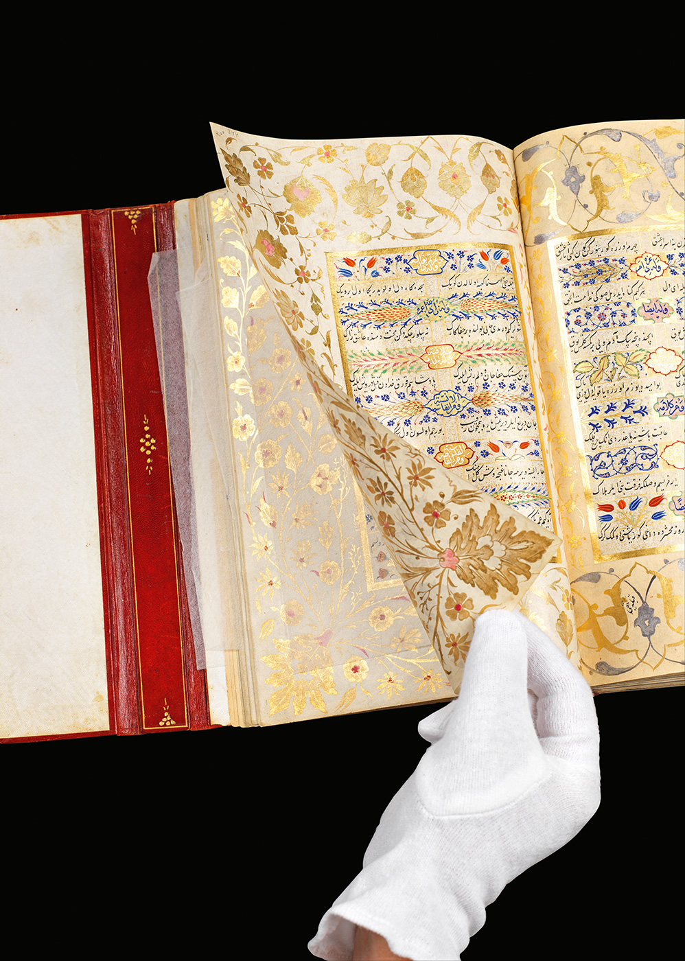
Sometimes it may be difficult for a facsimile to do justice
to a manuscript.
The weightlessness of the paper, light caught by the gold, pathways of light created with the slightest movement of the hand, the richness of decoration unfolding page after page are not easy to convey with reproduction photographs.
Taken from the point of view of the reader turning the pages, a new set of photographs was prepared.
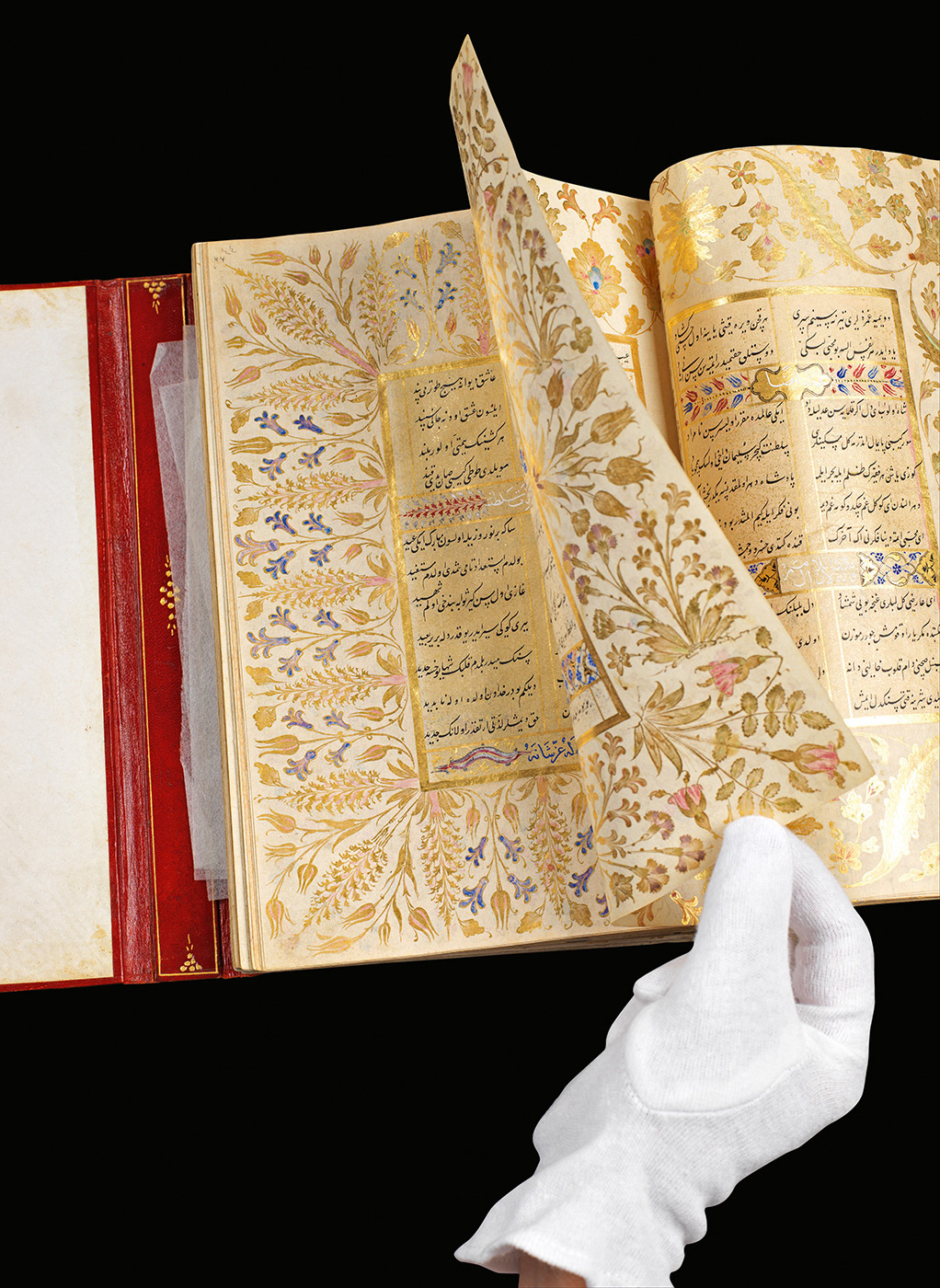
Within the book, these photographs are printed at a scale
that shows the true dimensions of the manuscript.
The integration of text and image in the original can be seen in the full-page reproduction on the left.
Similarly, text and image are integrated in my layout.
The images almost complete the writer’s sentences.
At times, Atasoy may describe a great number of images in a paragraph or a single sentence. By integrating text and image I could follow the author’s way of presenting her material closely and effortlessly.
The typeface is Agmena by Jovica Veljović. It has a hand-written character and diamond-shaped punctuation marks. These features make it a natural companion to
Ottoman calligraphy.
The size of the book accomodates the pages of the original printed
at true size (right-hand pages).
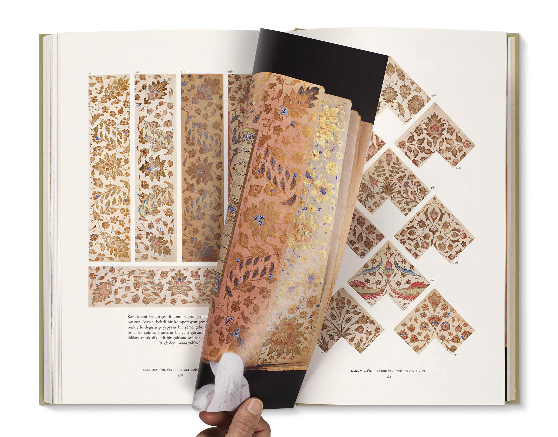
In my layout, compositions almost never repeat themselves. However, clarity and order—characteristics of Ottoman art—are maintained.
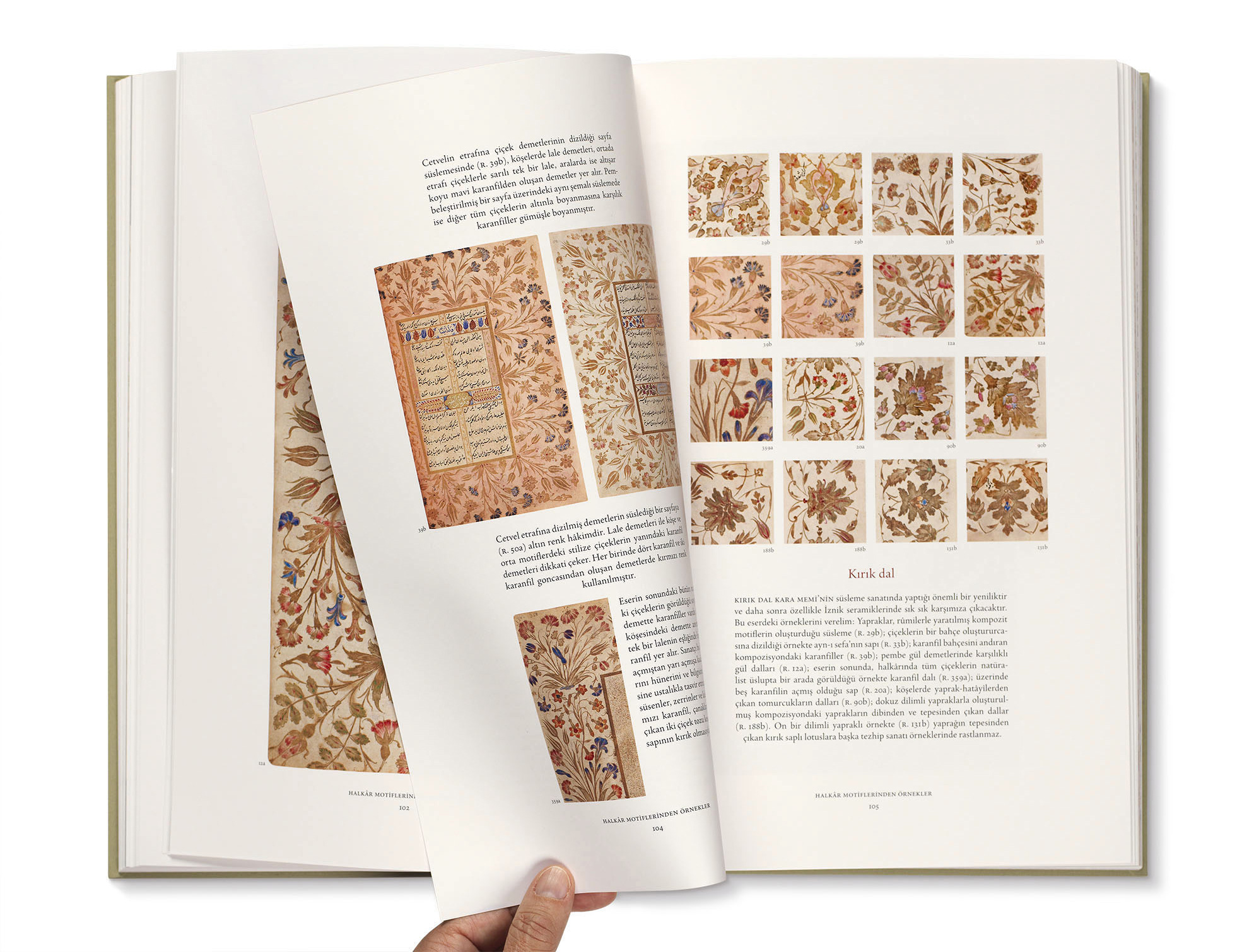
Kara Memi left his mark on every area of Ottoman art. His stylistic innovations are described in the last part of the book. Here the images are used larger than in previous chapters (right).
Kara Memi left his mark on every area of Ottoman art. His stylistic innovations are described in the last part of the book. Here the images are used larger than in previous chapters.
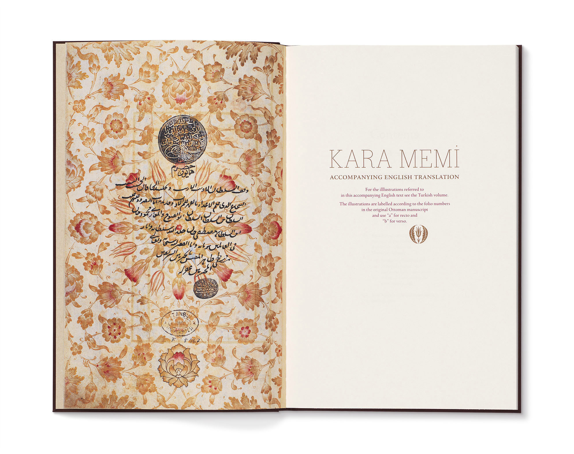
The English translation is in a separate volume. The reader can easily refer to the main
Turkish volume for the images.
All photographs by Hadiye Cangökçe, facsimile by Mas Matbaa, structural design of the box by Cenap Kangöz. Published by Masa, printed by Mas Matbaa in 2016.