Swordsman,
historian,
mathematician,
artist,
calligrapher
Matrakçı Nasuh
and his
Menazilname
Account of
the stages of
Sultan Süleyman
Khan’s
Iraqi
campaign
“… Matrakçı Nasuh’s pictorial language is much more complex than the language of some other miniature painters … Let us examine the depiction of Topkapı Palace. Two of the three courtyards which lie along a single axis are where they should be. But it appears that Nasuh did not have room to include the third courtyard on the same axis. However, this did not cause a problem for Nasuh. He merely bent the axis by 90 degrees and placed the third courtyard in the space thus created … Basically this reminds one very much of the approach and methods used by modern artists,” writes Nurhan Atasoy in the book accompanying the manuscript.
As I walked to school as a teenager I remember seeing the 1976 facsimile of this manuscript in the window display of a bookshop. Four decades later, the project fell into my lap.
For extra information on Nasuh’s manuscript kept at the Rare Books Section of Istanbul University, please see: https://www.facsimilefinder.com/facsimiles/menazilname-facsimile
read more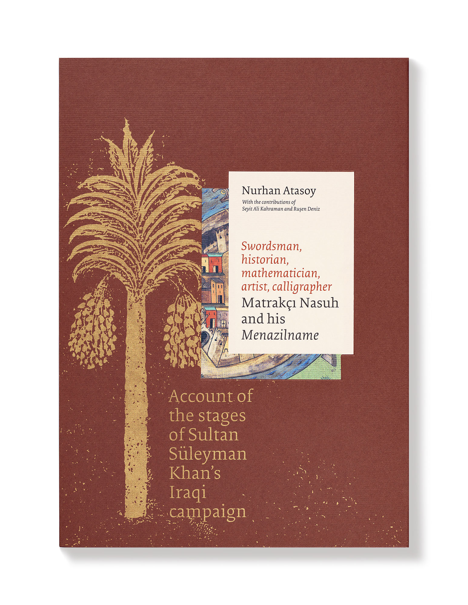
The slipcase holds the facsimile of Nasuh’s Menazilname and a companion book by Nurhan Atasoy.
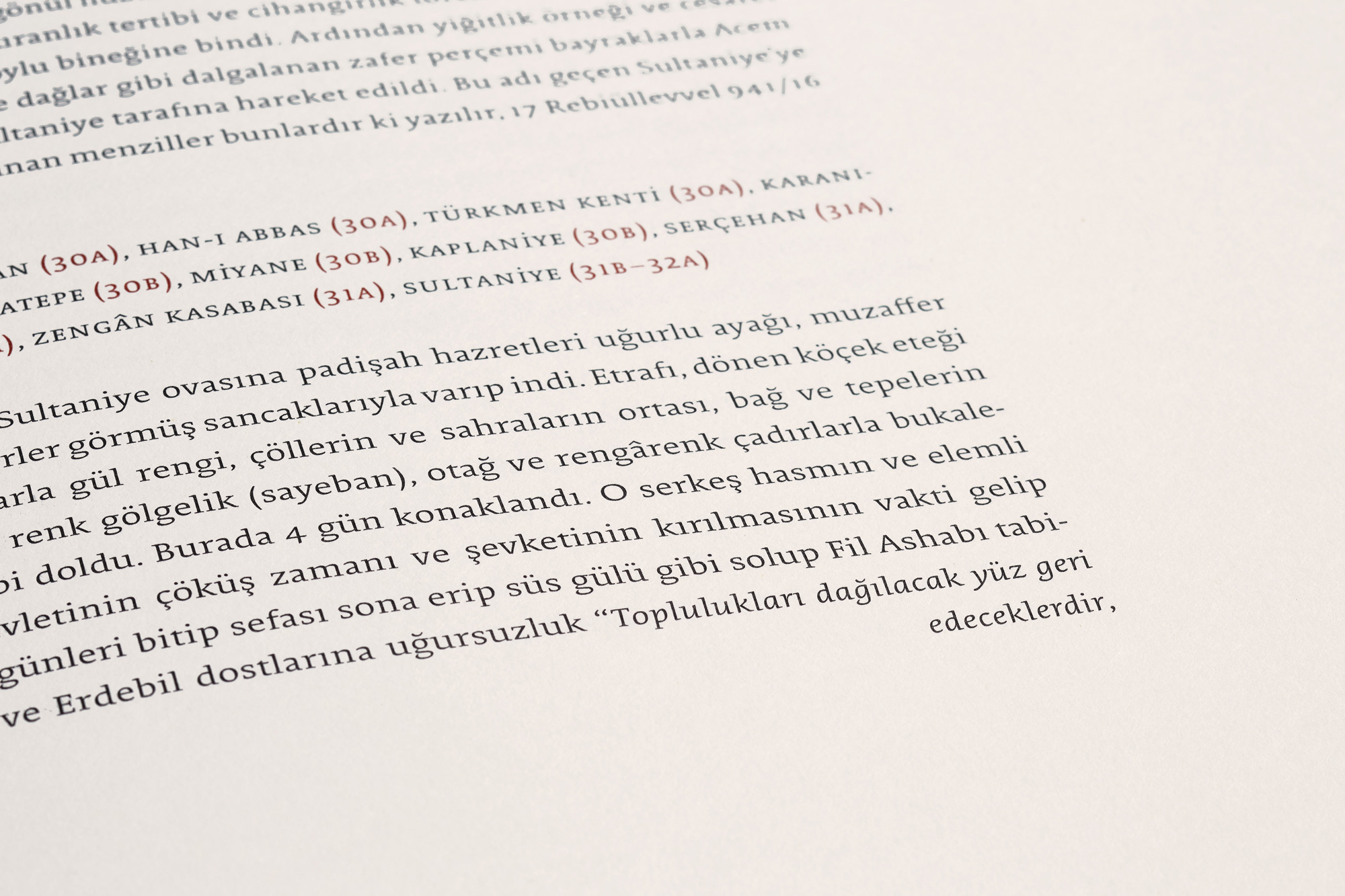
The Turkish edition additionally contains the transliteration of the original text in a separate book.
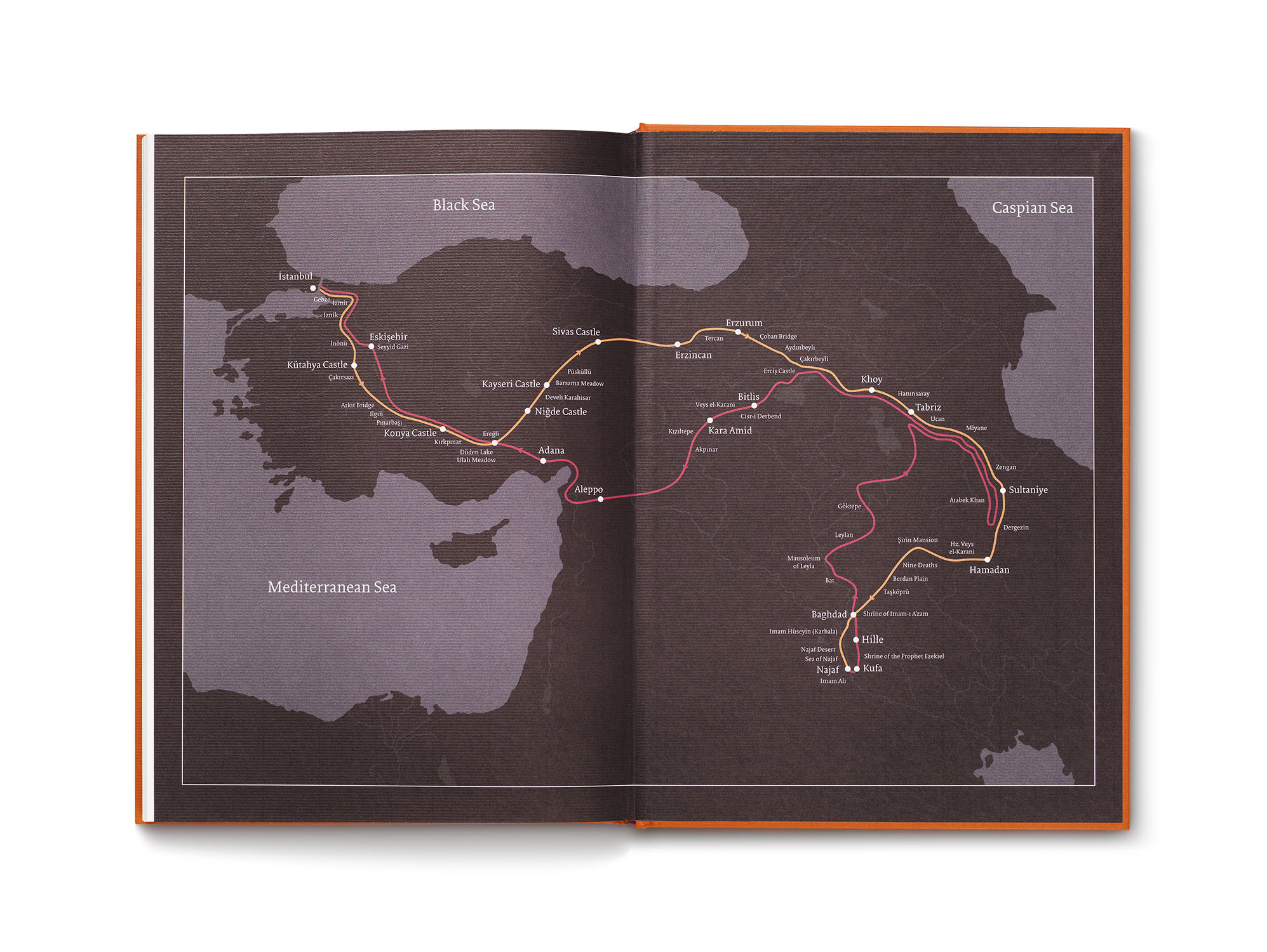
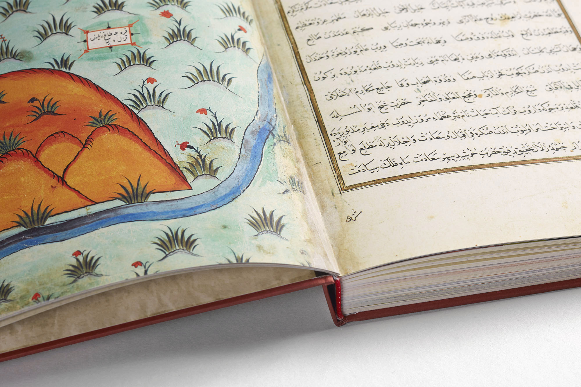
The manuscript is an illustrated narration of the route taken by the Ottoman army during the 1534 campaign of Süleyman the Magnificent to Iran and Iraq.
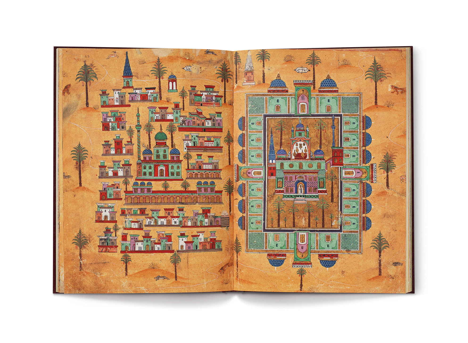
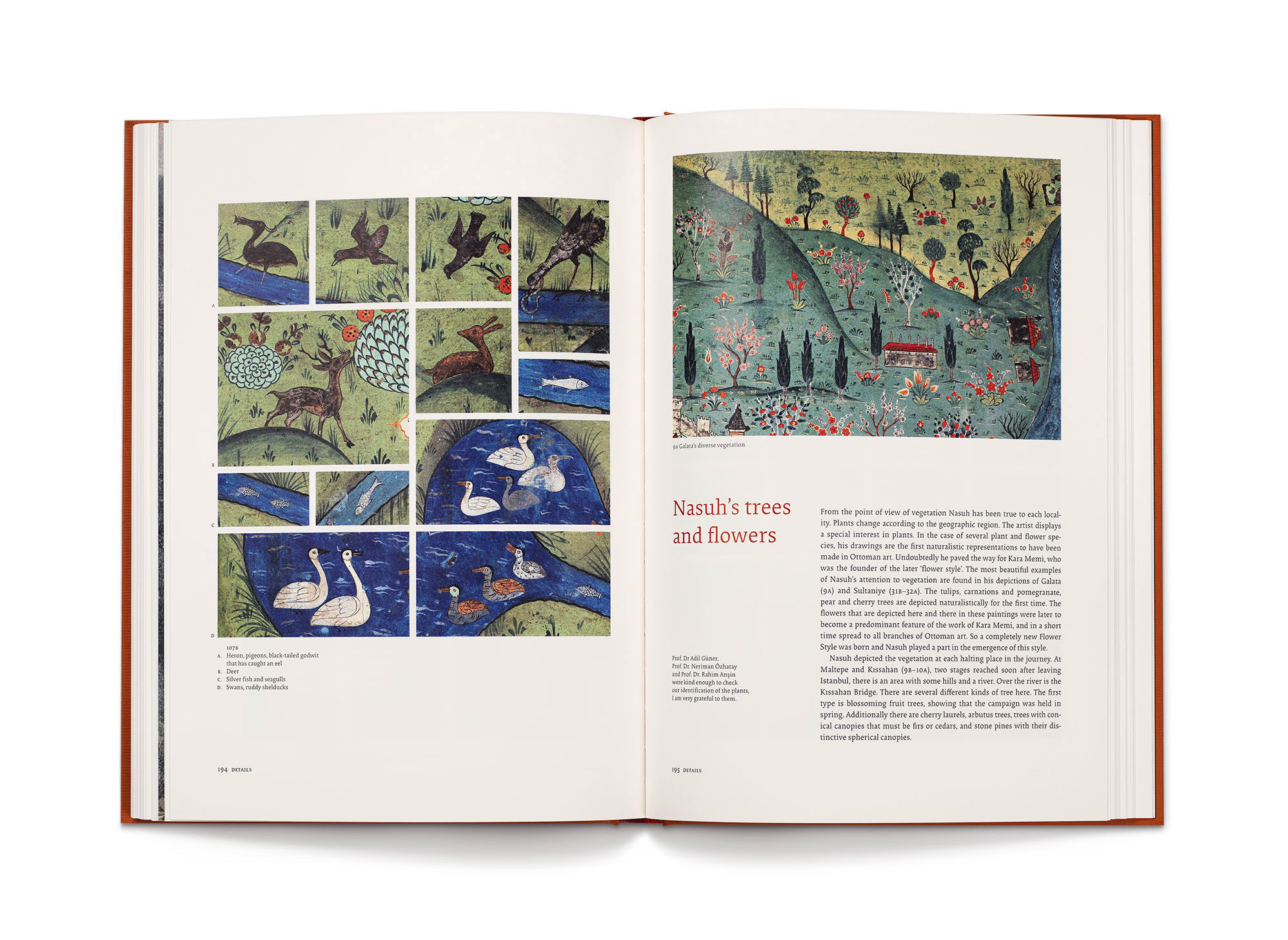
A page from the facsimile. Nasuh depicted not only the architecture of the places where the army camped, but also their flora and fauna (note the lions, rabbits, and deer above). The first naturalistic depictions of many plants can be seen
in this manuscript.
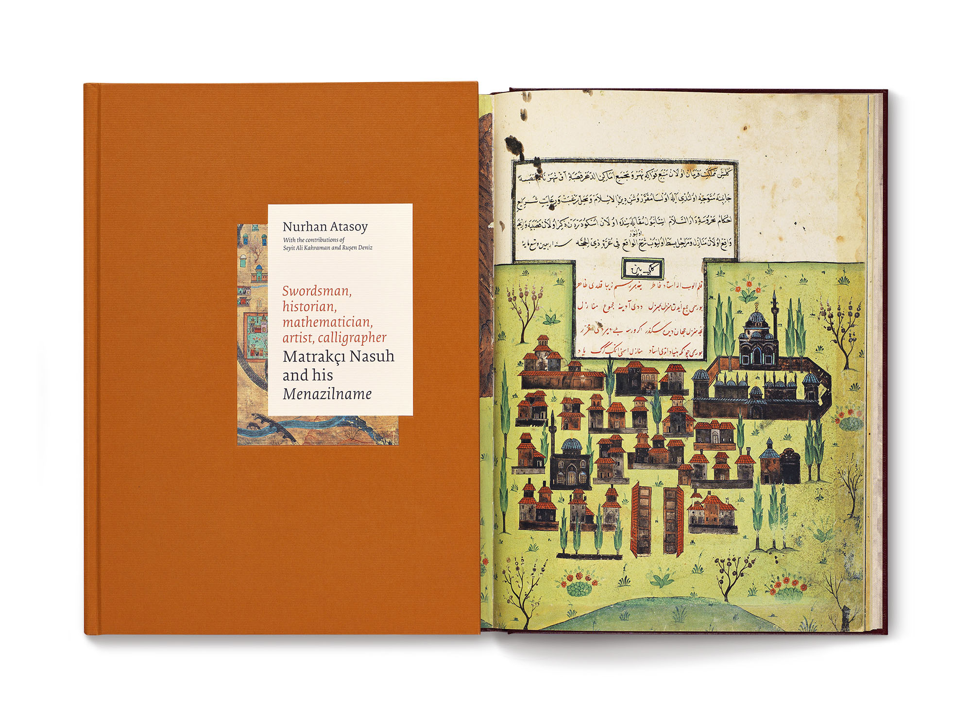
On the left is the orange cover of the book. On the right is a page from the facsimile. The idea of using labels on the cover and the slipcase is inspired by the way text is presented in the original.
During the time of the campaign, the Empire is at its zenith, comparing itself to no other. As a designer, how to match this confidence? One way was to choose a typeface so sure of itself as to have only one weight. I used Collis by The Enschedé Type Foundry which has neither a light, nor a bold version. Beginning from the slipcase up to the map printed on the endpaper at the back, Collis typeface was used for the entire book.
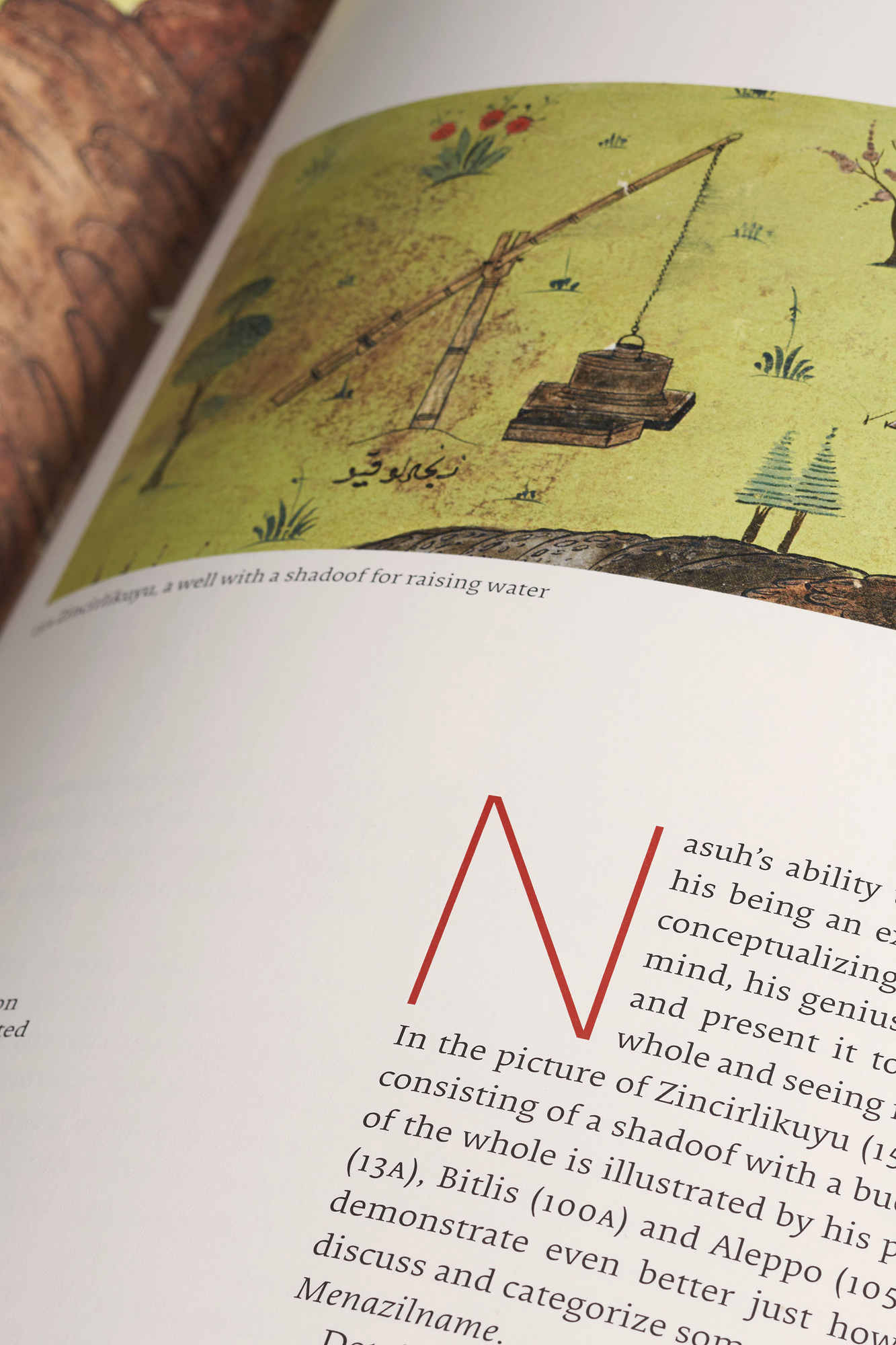
To mark the few chapter openings, I used a lean typeface by Nick Shinn, Sense. It “cuts to the chase”, like Nasuh’s miniatures. The letter “N” and the shadoof in the miniature have the same linear character.
To suggest the march of the army towards its destination, the layout of the book emphasizes the horizontal
as much as possible.
Nowadays, the term “çiçek, böcek” (flowers and insects) is derogatory connoting the trivial in contrast to the important. Nasuh has boldly documented these so-called trivialities. A military campaign could not be a reason to disregard flowering trees, and ducks swimming along a river.
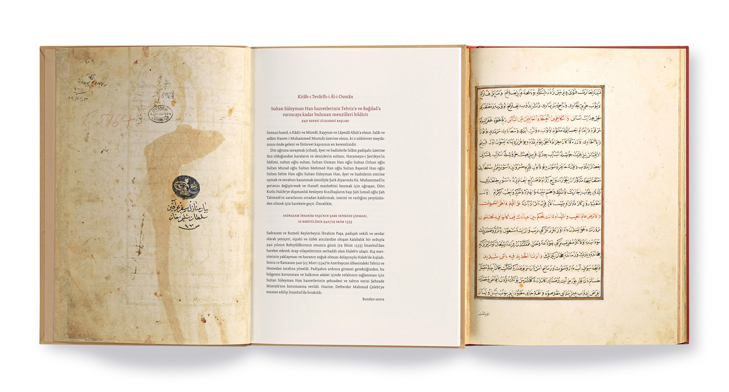
On the left, a spread from the transliteration. On the right, a page from the original. The transliteration is designed to be in the same format as the original. This includes the catchword placed at the foot of the page anticipating
the first word of the following page.
Text by Nurhan Atasoy. Reproduction photography by Hadiye Cangökçe.
Published in separate English and Turkish editions by Masa.
Printed by Mas Matbaa in 2015.