
The Seljuks
A journey
through
Anatolian
architecture
“ … The architecture of the Seljuks is outstanding in terms of the perfection that was achieved in ornamentation and of the craftsmanship of their stone carving.” writes Ahmet Ertuğ in the foreword to the book.
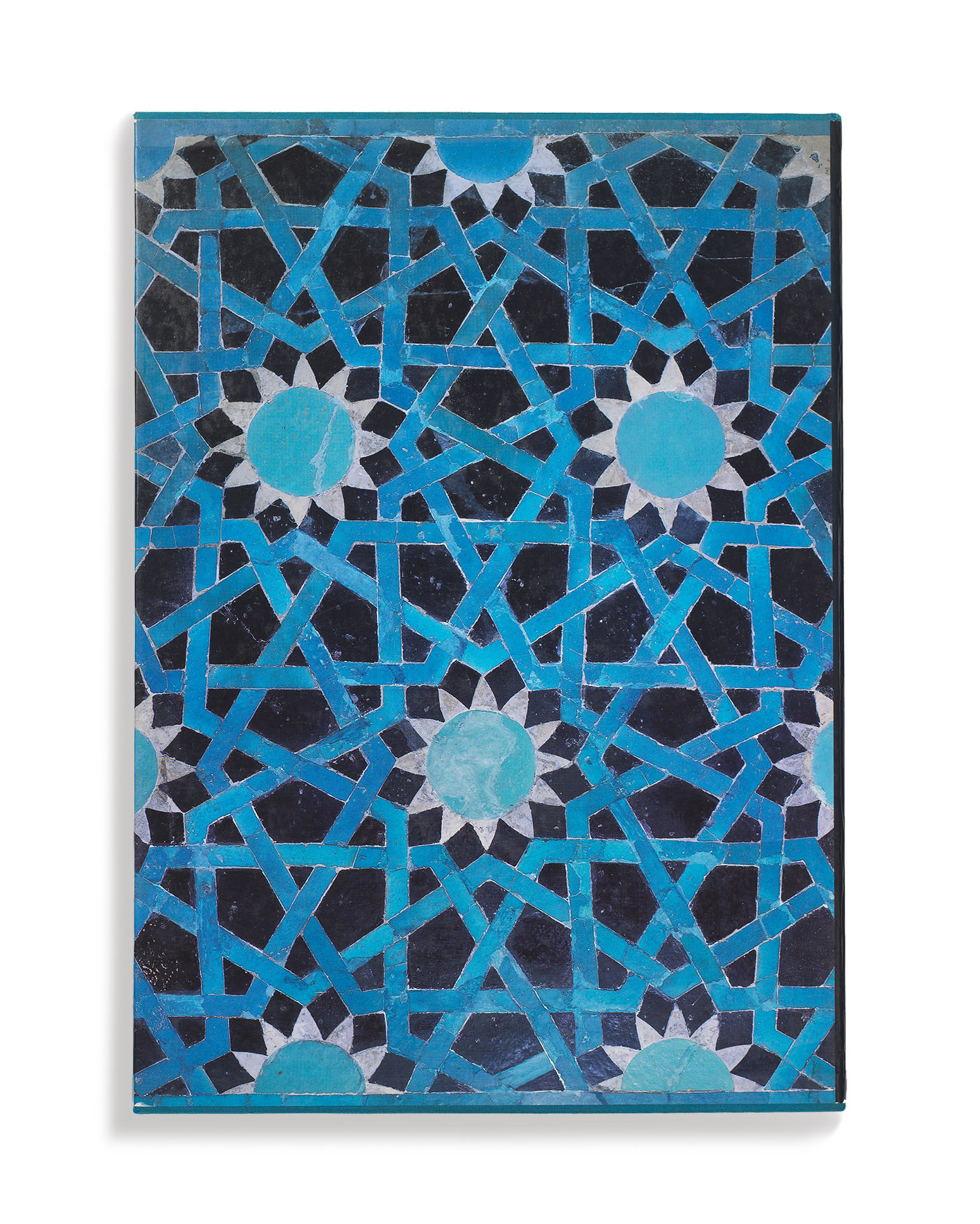
Just as turquoise glazed tiles are often seen in the buildings of the Anatolian Seljuks, the same colour has been used for the cover.
read more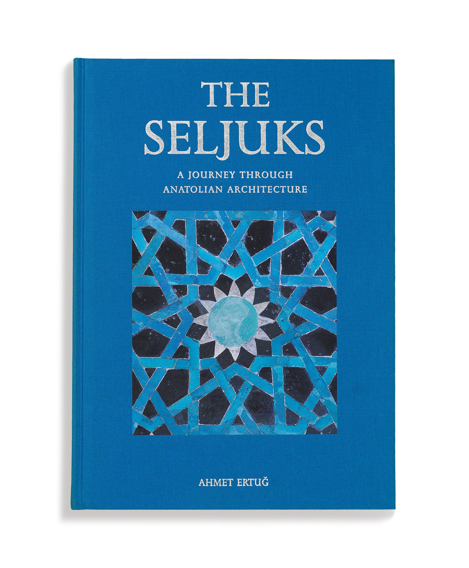
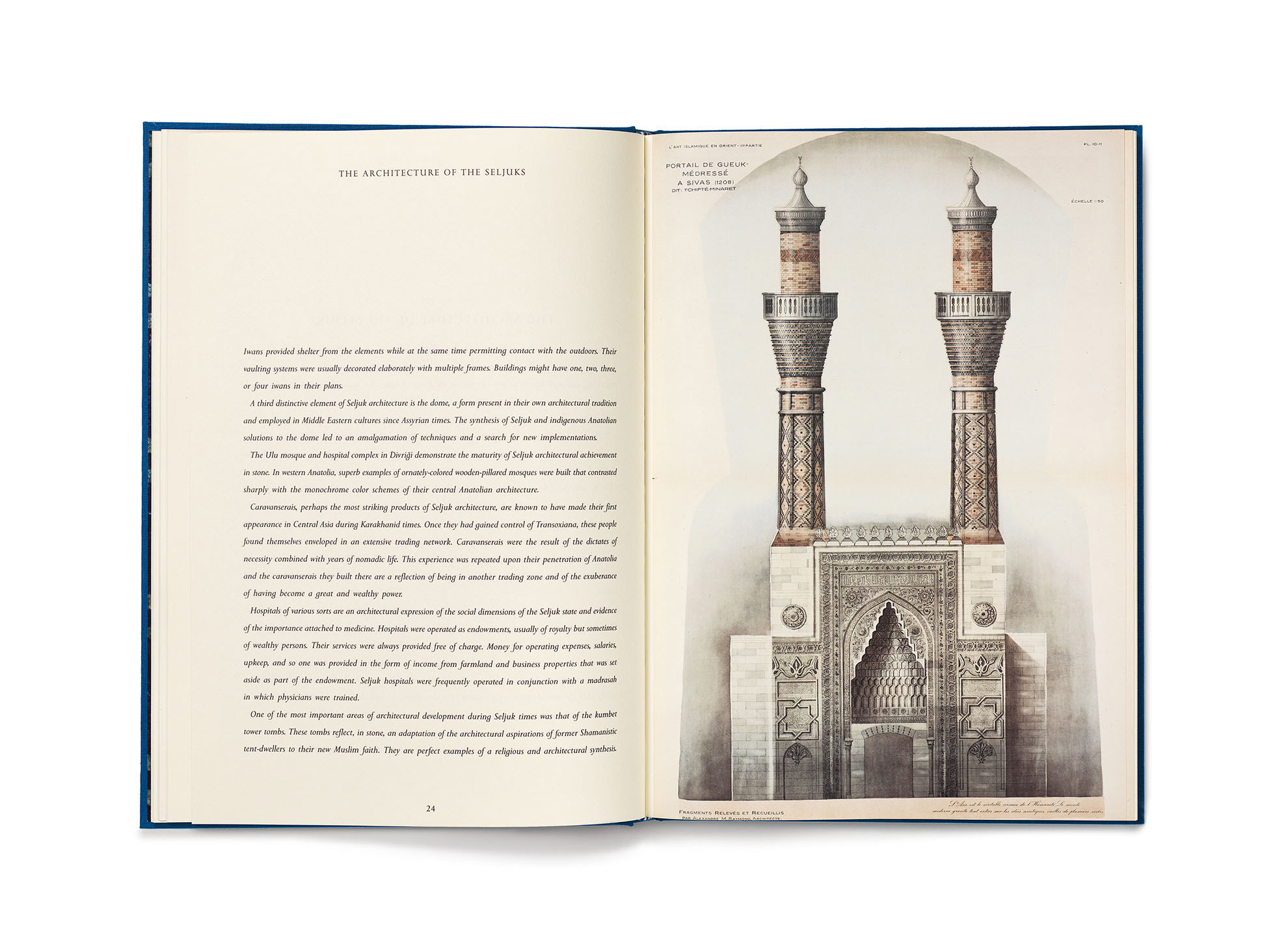
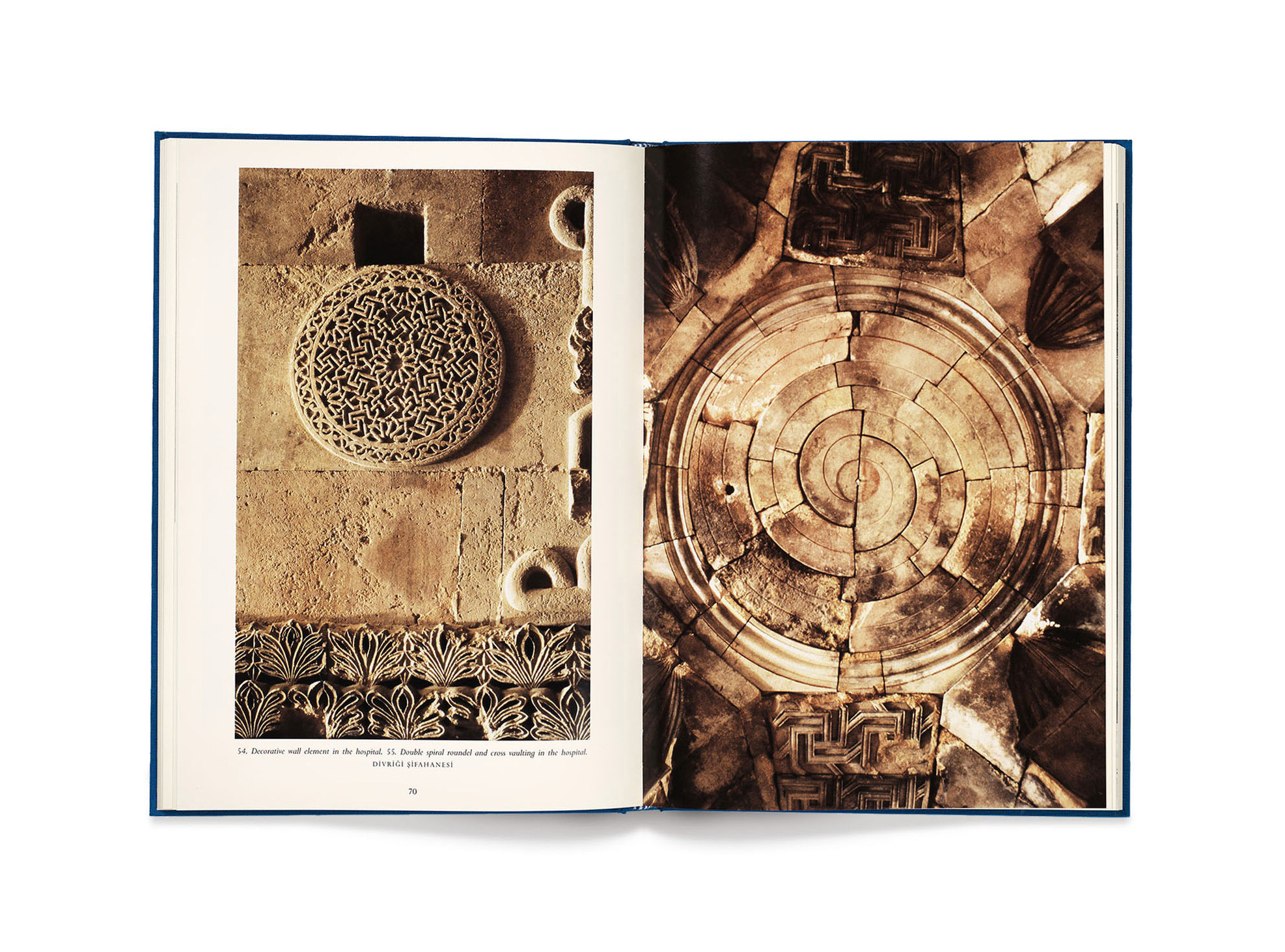
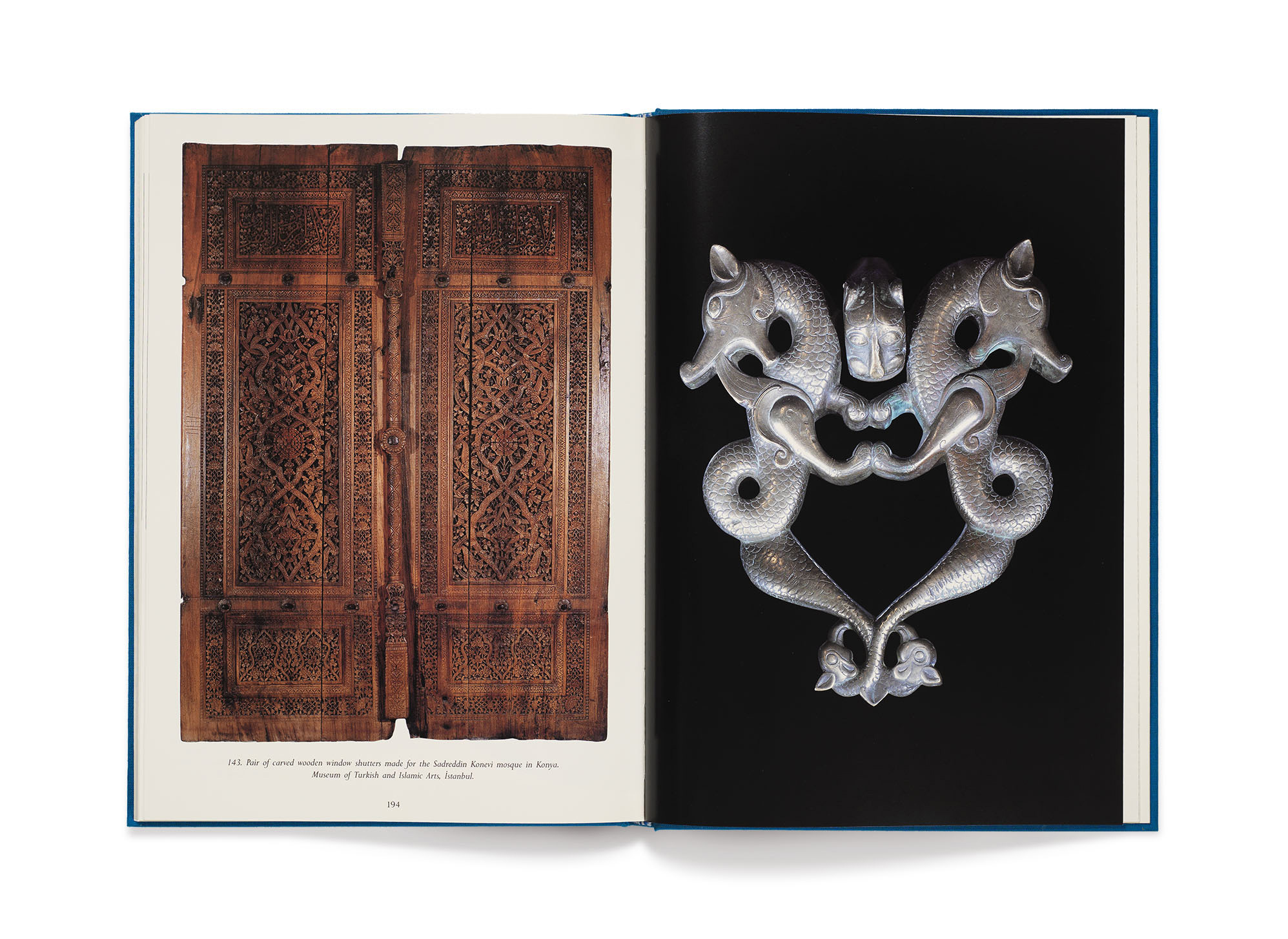
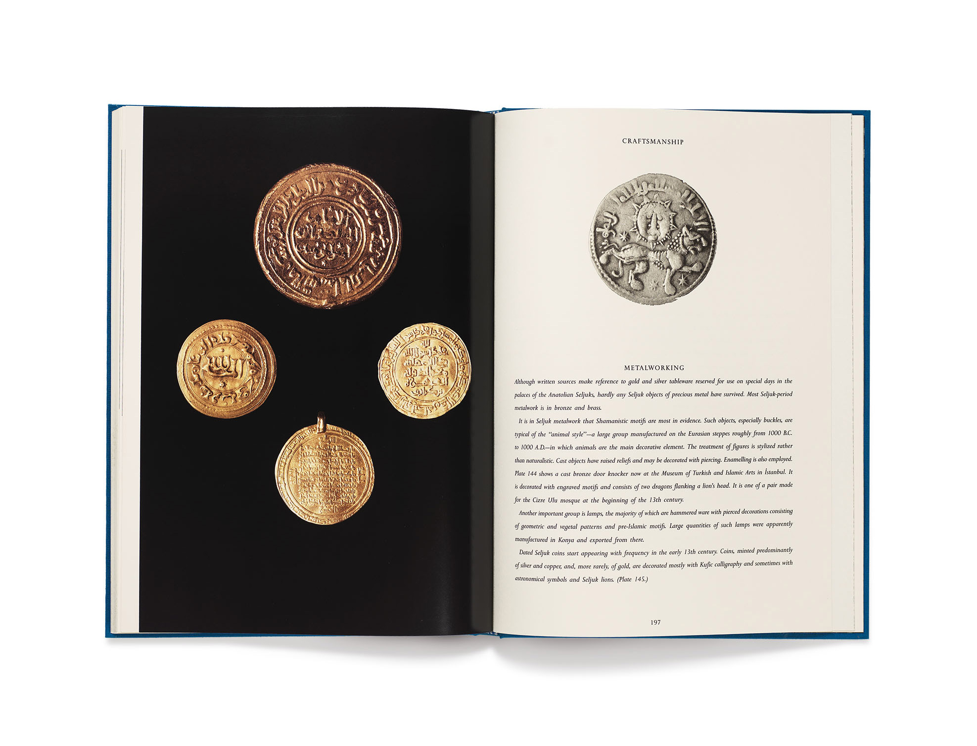
Illustrations, some architectural details, artefacts such as coins and carpets are printed in colour on Scheufelen ivory coated paper.
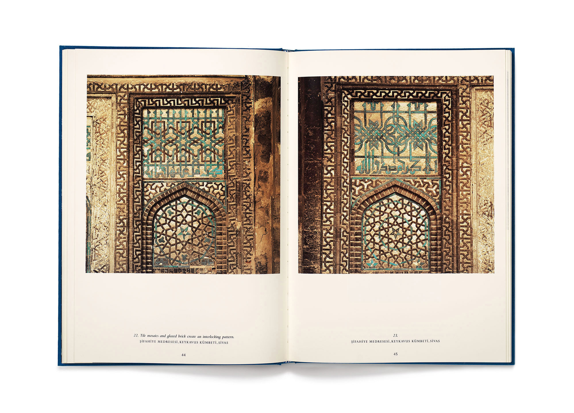

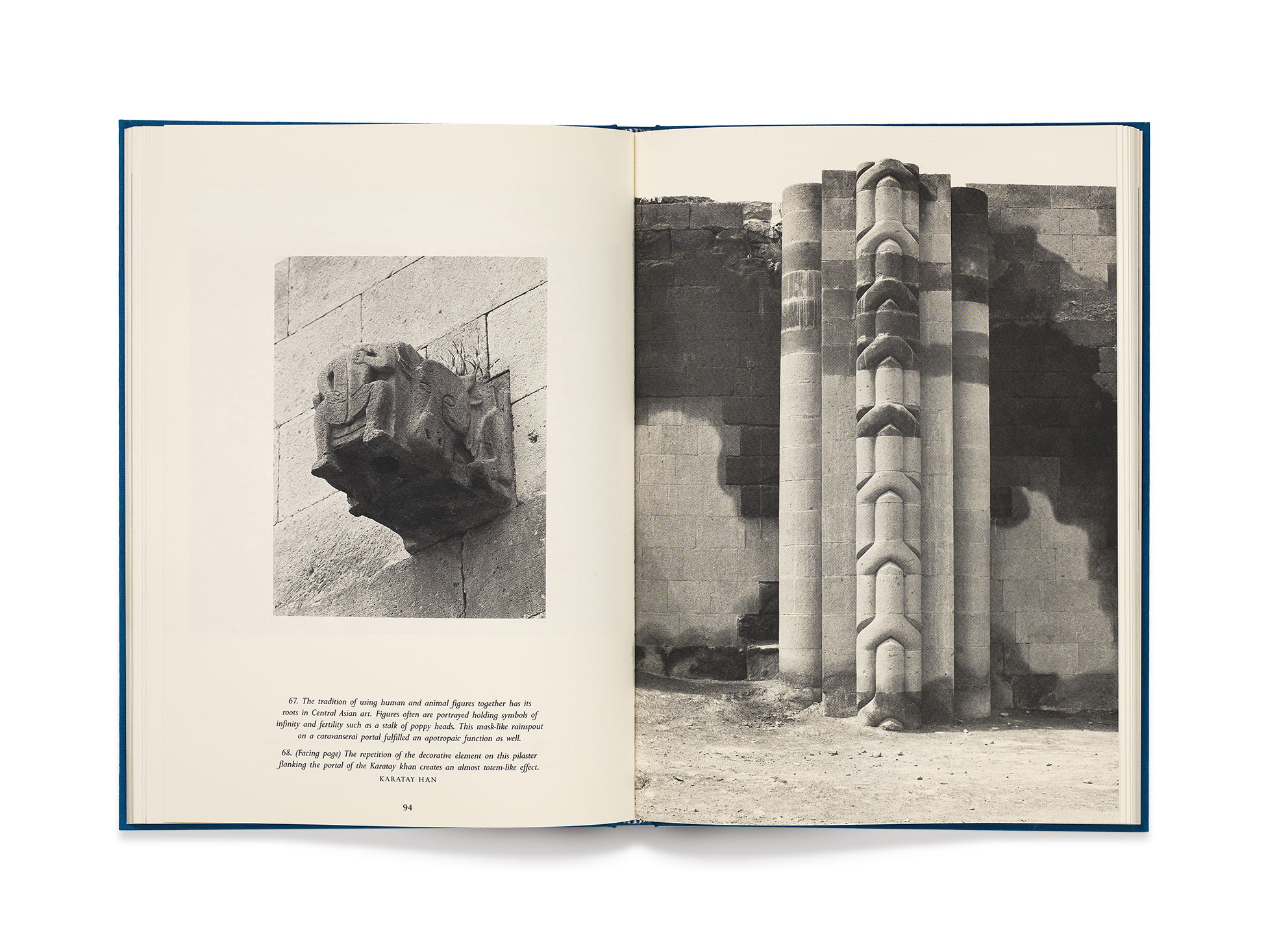
Stone, the material used in the buildings, informs the choice of a textured stock by Fedrigoni for printing the black and white architectural photographs by Eduard Widmer.
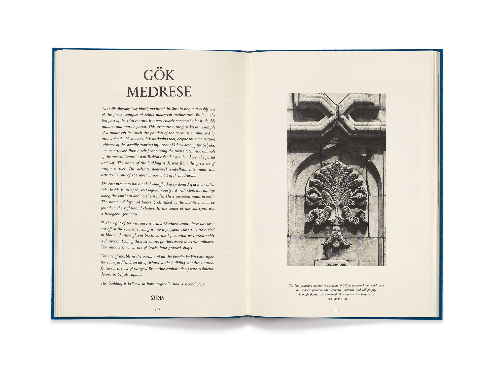
The typeface is Perpetua by Eric Gill who was not only a type designer but a stone cutter as well.
Main photography by Eduard Widmer, text by Mine Timur Bragner, typeset by Osman Tülü, colour separation by Ast + Jacob.
Project coordinated and published by Ahmet Ertuğ, printed by Amilcare Pizzi in 1991.